Import the numpy module as np, and check that np.sin(0) returns a value of 0.
Import the datascience module as ds, and check the table creation works correctly.
# Solution to Task 1# Part 1: Import numpy and test sin functionimport numpy as npprint("np.sin(0) =", np.sin(0))# Part 2: Import datascience and test table creationimport datascience as dstable_result = ds.Table().with_columns("Col1", [1, 2, 3],"Col2", [2, 3, 4])print(table_result)
np.sin(0) = 0.0
Col1 | Col2
1    | 2
2    | 3
3    | 4
Task 2 Solutions
Task 2 Solutions: Create x_list and x_array containing elements 1, 2, and 3, then compute mean and median.
# Solution to Task 2# Create x_list as a regular Python listx_list = [1, 2, 3]# Create x_array as a numpy arrayx_array = np.array([1, 2, 3])# Compute mean and median for x_listprint("x_list mean:", np.mean(x_list))print("x_list median:", np.median(x_list))# Compute mean and median for x_arrayprint("x_array mean:", np.mean(x_array))print("x_array median:", np.median(x_array))# Verify they give the same resultsprint("\nBoth give the same results!")
x_list mean: 2.0
x_list median: 2.0
x_array mean: 2.0
x_array median: 2.0

Both give the same results!
Task 3 Solutions
Task 3 Solutions: Look up np.ptp() function and apply it to the data.
Answer: The np.ptp() function computes the range of values (maximum - minimum) along an axis. PTP stands for “Peak To Peak” - the difference between the maximum peak and minimum peak values.
# Solution to Task 3# Apply np.ptp() to x_list and x_array from Task 2print("Range of x_list using np.ptp():", np.ptp(x_list))print("Range of x_array using np.ptp():", np.ptp(x_array))# Manual verification: max - minprint("Manual calculation: max - min =", max(x_list) -min(x_list))# Both should give the same result: 3 - 1 = 2
Range of x_list using np.ptp(): 2
Range of x_array using np.ptp(): 2
Manual calculation: max - min = 2
Task 4 Solutions
Task 4 Solutions: Compute standard deviation by hand and compare with np.std() function.
# Solution to Task 4x_list = [1, 2, 3] # From Task 2# Part (a): Calculate sample standard deviation by hand (using n-1)# Mean = (1 + 2 + 3) / 3 = 2mean_x =2# Sample variance = [(1-2)² + (2-2)² + (3-2)²] / (3-1)# = [1 + 0 + 1] / 2 = 2/2 = 1sample_variance = ((1-2)**2+ (2-2)**2+ (3-2)**2) / (3-1)sample_std = np.sqrt(sample_variance)print("Sample standard deviation (by hand):", sample_std)print("Sample standard deviation (by hand):", np.sqrt(1)) # Should be 1.0# Part (b): Compare with np.std(x_list)print("np.std(x_list) default:", np.std(x_list))print("Does this match part (a)?", np.isclose(sample_std, np.std(x_list)))# Part (c): Calculate population standard deviation by hand (using n)# Population variance = [(1-2)² + (2-2)² + (3-2)²] / 3# = [1 + 0 + 1] / 3 = 2/3population_variance = ((1-2)**2+ (2-2)**2+ (3-2)**2) /3population_std = np.sqrt(population_variance)print("Population standard deviation (by hand):", population_std)print("This matches np.std(x_list):", np.isclose(population_std, np.std(x_list)))# Part (d): Use ddof=1 to get sample standard deviationprint("np.std(x_list, ddof=1):", np.std(x_list, ddof=1))print("This matches part (a):", np.isclose(sample_std, np.std(x_list, ddof=1)))
Sample standard deviation (by hand): 1.0
Sample standard deviation (by hand): 1.0
np.std(x_list) default: 0.816496580928
Does this match part (a)? False
Population standard deviation (by hand): 0.816496580928
This matches np.std(x_list): True
np.std(x_list, ddof=1): 1.0
This matches part (a): True
Optional Task Solutions
Optional Task Solutions: Create a custom IQR function.
# Solution to Optional Taskdef calculate_iqr(data):""" Calculate the Interquartile Range (IQR) of a dataset. Parameter: data - a list or array of numbers Returns: The IQR value (Q3 - Q1) """# Calculate the IQR using the numpy method we learned iqr_value = np.diff(np.percentile(data, [25, 75]))[0]return iqr_value# Test the functiontest_scores = [72, 85, 90, 78, 92, 88, 76, 94, 82, 89, 91, 77]# Use our custom functionmy_iqr = calculate_iqr(test_scores)print(f"IQR using our function: {my_iqr}")# Compare with the direct methoddirect_iqr = np.diff(np.percentile(test_scores, [25, 75]))[0]print(f"IQR using direct method: {direct_iqr}")# They should be the same!print(f"Results match: {np.isclose(my_iqr, direct_iqr)}")
IQR using our function: 12.5
IQR using direct method: 12.5
Results match: True
Task 5 Solutions
Task 5 Solutions: Create boxplots with various customizations.
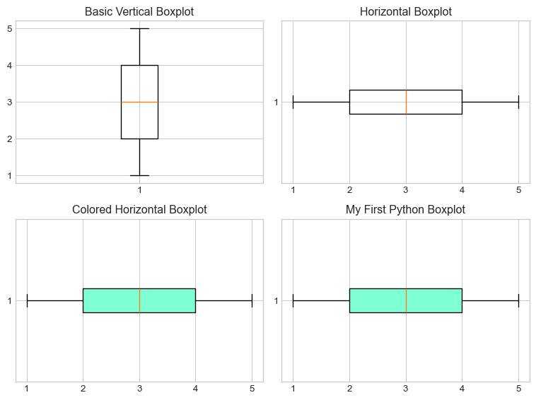
# Solution to Task 5# Import matplotlib for plottingimport matplotlib.pyplot as plt%matplotlib inlineplt.style.use('seaborn-v0_8-whitegrid')# Step 1: Create the list yy = [1, 2, 3, 4, 5, 4, 3, 5, 4, 1, 2]# Step 2: Create basic vertical boxplotplt.figure(figsize=(8, 6))plt.subplot(2, 2, 1)plt.boxplot(y)plt.title("Basic Vertical Boxplot")# Step 3: Create horizontal boxplotplt.subplot(2, 2, 2)plt.boxplot(y, orientation='horizontal')plt.title("Horizontal Boxplot")# Step 4: Add colorplt.subplot(2, 2, 3)plt.boxplot(y, orientation='horizontal', patch_artist=True, boxprops=dict(facecolor="aquamarine"))plt.title("Colored Horizontal Boxplot")# Step 5: Final version with titleplt.subplot(2, 2, 4)plt.boxplot(y, orientation='horizontal', patch_artist=True, boxprops=dict(facecolor="aquamarine"))plt.title("My First Python Boxplot")plt.tight_layout()plt.show()# Answer the IQR questionprint("\nBased on the boxplot:")print("Q1 (25th percentile) appears to be around 2")print("Q3 (75th percentile) appears to be around 4.5")print("So IQR ≈ 4.5 - 2 = 2.5")# Verify with Python calculationiqr_calculated = np.diff(np.percentile(y, [25, 75]))[0]print(f"\nActual IQR calculated by Python: {iqr_calculated}")
Based on the boxplot:
Q1 (25th percentile) appears to be around 2
Q3 (75th percentile) appears to be around 4.5
So IQR ≈ 4.5 - 2 = 2.5

Actual IQR calculated by Python: 2.0
Task 6 Solutions
Task 6 Solutions: Create a histogram with appropriate bins and labels.
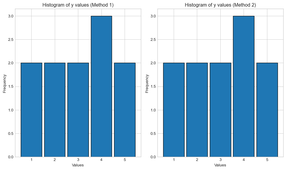
# Solution to Task 6y = [1, 2, 3, 4, 5, 4, 3, 5, 4, 1, 2] # From Task 5# Create histogram with appropriate binsplt.figure(figsize=(10, 6))# Method 1: Using explicit bin edgesplt.subplot(1, 2, 1)plt.hist(y, bins=[0.5, 1.5, 2.5, 3.5, 4.5, 5.5], rwidth=0.9, edgecolor='black')plt.xlabel('Values')plt.ylabel('Frequency')plt.title('Histogram of y values (Method 1)')# Method 2: Using range and bins parametersplt.subplot(1, 2, 2)plt.hist(y, bins=5, range=(0.5, 5.5), rwidth=0.9, edgecolor='black')plt.xlabel('Values')plt.ylabel('Frequency')plt.title('Histogram of y values (Method 2)')plt.tight_layout()plt.show()# Show frequency count for verificationunique, counts = np.unique(y, return_counts=True)print("Value frequencies:")for value, count inzip(unique, counts):print(f"Value {value}: appears {count} times")
Value frequencies:
Value 1: appears 2 times
Value 2: appears 2 times
Value 3: appears 2 times
Value 4: appears 3 times
Value 5: appears 2 times
Task 7 Solutions
Task 7 Solutions: Create a scatterplot with proper labels.
# Solution to Task 7# Part 1: Copy and run the provided codenp.random.seed(5)x1 = np.random.normal(0, 1, 100)x2 = x1 + np.random.normal(0, 1, 100)plt.figure(figsize=(8, 6))plt.scatter(x1, x2)# Part 2: Add labels and titleplt.xlabel('x1')plt.ylabel('x2')plt.title('My First Python Scatterplot')plt.grid(True, alpha=0.3)plt.show()# Additional information about the plotprint(f"Number of points plotted: {len(x1)}")print(f"x1 range: {x1.min():.2f} to {x1.max():.2f}")print(f"x2 range: {x2.min():.2f} to {x2.max():.2f}")
Number of points plotted: 100
x1 range: -2.86 to 2.43
x2 range: -4.00 to 4.10
Task 8 Solutions
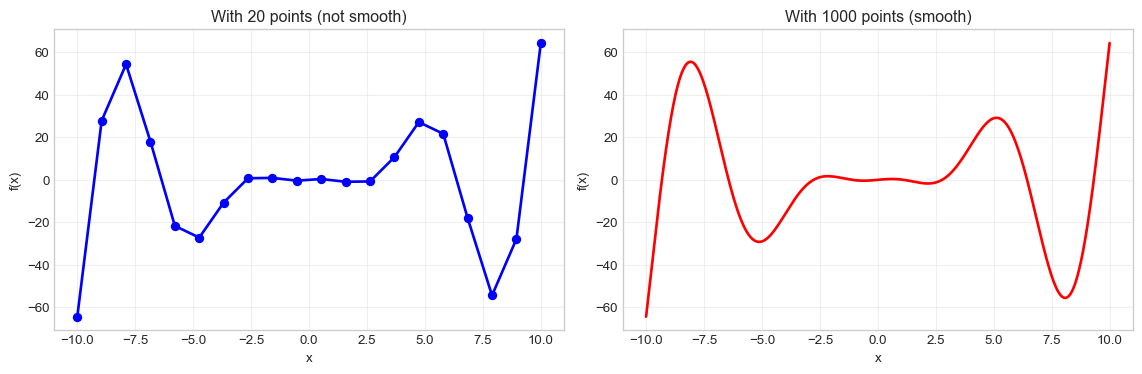
Task 8 Solutions: Plot the function f(x) = x - x²sin(x) between x = -10 and x = 10.
# Solution to Task 8# Create x values using linspace for a smooth plotx = np.linspace(-10, 10, 1000) # 1000 points for smoothness# Define the function f(x) = x - x²sin(x)y = x - x**2* np.sin(x)# Create the plot with red colorplt.figure(figsize=(12, 8))plt.plot(x, y, color='red', linewidth=2)plt.xlabel('x')plt.ylabel('f(x)')plt.title('Plot of f(x) = x - x²sin(x)')plt.grid(True, alpha=0.3) # Add a light grid for better readabilityplt.show()# Show what happens with fewer points for comparisonplt.figure(figsize=(12, 4))# Fewer points - not smoothplt.subplot(1, 2, 1)x_few = np.linspace(-10, 10, 20)y_few = x_few - x_few**2* np.sin(x_few)plt.plot(x_few, y_few, color='blue', linewidth=2, marker='o')plt.xlabel('x')plt.ylabel('f(x)')plt.title('With 20 points (not smooth)')plt.grid(True, alpha=0.3)# Many points - smoothplt.subplot(1, 2, 2)plt.plot(x, y, color='red', linewidth=2)plt.xlabel('x')plt.ylabel('f(x)')plt.title('With 1000 points (smooth)')plt.grid(True, alpha=0.3)plt.tight_layout()plt.show()print("Notice how more points create a smoother curve!")
Notice how more points create a smoother curve!
Summary of Key Learning Points
Key Functions Learned:
np.mean() - Calculate mean
np.median() - Calculate median
np.std() - Calculate standard deviation (use ddof=1 for sample std)